Visualization (Viz) module
Backend Server

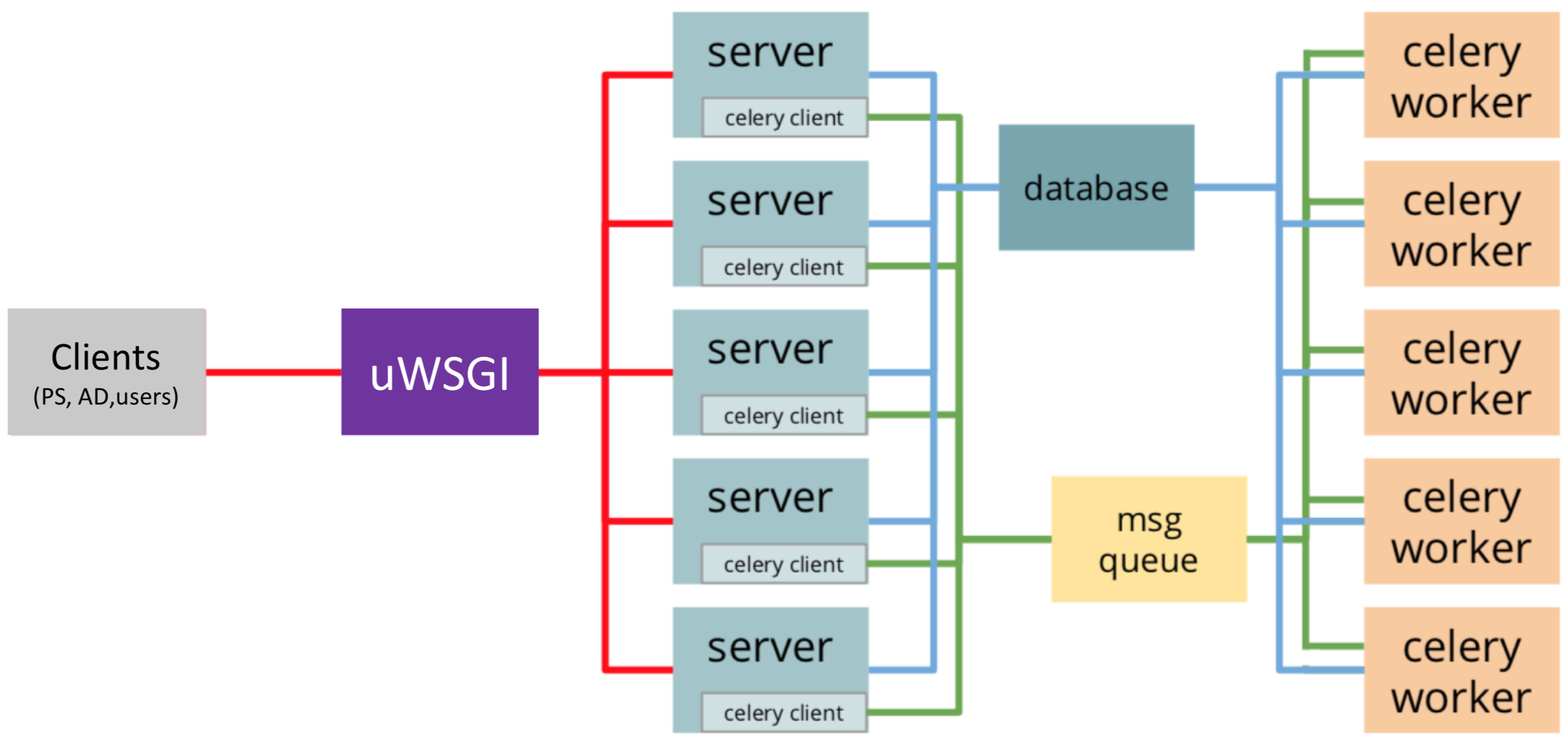
The architecture for visualization backend server including uWSGI workers serving concurrent connections, celery workers and a Redis message queue for asynchronous tasks and a database for data storage.
The backend server is designed to support
Huge amounts of concurrent requests as many as the number of on-node AD modules currently running
Streaming workflow-level performance analysis results (from PS) with minimal memory overhead
Handling long running tasks asynchronously
For this, the server is designed to have two levels of scaling. At the first level, uWSGI will instantiate the web application in its first process and will fork multiple times until the desired number of workers is reached. Each of them will be fully instantiated to be ready to serve connections. At the second level, especially to handle the long-running tasks (e.g. inserting/querying data into/from database) asynchronously, the requests are distributed over pre-forked processes (celery workers and Redis message queue) and return response as quickly as possible. Finally, streaming (or broadcasting) data to the connected users is done by using Websocket technology with socket IO library.
Frontend visualization
The frontend visualization design presents data in different levels of detail by following the Overview first, zoom and filter, then details on-demand mechanism commonly adopted in the visualization domain.
In-Situ Visualization

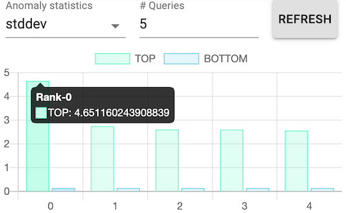
Dynamic ranking dashboard as rank-level visualization granularity for the most and the least problematic MPI processes.
Using the data from the Parameter Server (PS), the in-situ visualization receives data in a streaming fashion and processes that into a number of anomaly statistics. We aim to provide a dynamic ranking dashboard of the most and least problematic MPI ranks as a rank-level granularity of the application. The available statistics includes the average, standard deviation, maximum, minimum and the total number of anomaly functions. Users can select one of the statistic kinds along with the number ranks they want to see. Detailed information is available when hovering over each bar chart.

Streaming view of several series of the numbers of anomalies as time frame-level visualization granularity for various ranks.
Selecting (or clicking) bars in the ranking dashboard activates the visualization server to broadcast the number of anomalies to the connected users in a time frame while performance traced applications are running. This streaming scatter plot serves as a time frame-level granularity by showing the number of anomalies of a MPI rank within a time window.
Here, each dot represents a time frame of a selected rank. Color encoding is applied to differentiate different ranks. Hovering over a dot will pop up a window showing detailed information including the number of detected anomalies, time frame id, and the analyzed time range. Clicking one dot triggers the online analysis visualization that is explained in the following subsection.
Online Analysis Visualization
The online analysis visualization is designed to retrieve data from database and to present the finest level of granularity into the function execution details. It consists of two parts: a function view and a call stack view.

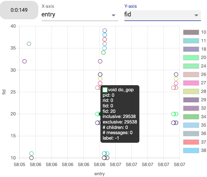
The function execution visualization for a selected time frame (ID 149) and Rank ID 0 for Application 0 in a “entry” vs. “fid” layout.
In the function view, it visualizes distribution of executed functions within a selected time interval. The distribution can be controlled by selecting X- and Y-axis among function ID, entry and exit time, inclusive and exclusive run time, label indicating if anomaly or not, the number of children functions, and the number of communication (messages). Hovering a circle will show all available information. Clicking a circle (or a function) will trigger a call stack view that includes the selected function.

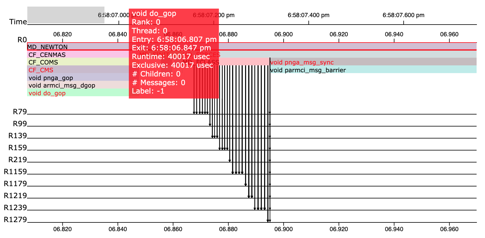
The call stack visualization for the selected function “MD_NEWTON”.
In the call stack view, users can more closely investigate the relationships among functions and communications over ranks. For example, in the above figure, it shows zoomed-in call stack view within the time range refined by an user. Anomaly labels are encoded by the color of the name of each function with black being normal and red being abnormal. Hovering over a horizontal bar in the call stack will pop up detailed information regarding the corresponding function. A communication (message receiving or sending) is encoded by an arrow between a function and a horizontal line representing another rank ID.
Furthermore
More details can be found in visualization repository.